Overview
Project four will be the first project in which I will have to begin to use the knowledge I have aquired so far and put it into a real working website. The site must have three working pages with links, style sheets, form and a SEO information. The theme for the website is to promote an event, product or occasion. The website must contain a homepage, inside page with text and images and a contact/form page. The website must be original and have some sort of humour or irony about it.
The website must contain
- two methods of navigation – text links, image link or hotspot link.
- an email link and a web link to another site
- a named anchor: eg a content list linking to other items on the same page and a “back to top” button.
- a pop up window containing enlarged image or more text
- a page containing form elements
- meta tags: create and insert title, keyword and description meta tags
Ideas
The theme for this website must be something original or comical, below is a page of brainstorm ideas I have come up with that I believe may offer these opportunities.
 Ideas for site
Theme
I have decided that I will go with the theme of a dog show for this project. I think its original and can have an element of humour by adding themes such as fancy dress dog competition. I also own a dog and have been to dog shows before so have some experience and ideas I can use for this theme. Below are a list of names for my site, the name I like best for the dog show is “SCRUFFS” it plays on the famous dog show name of “crufts” whilst adding an element of fun.
Website Examples
I have started collecting examples of website layout and design I think may work well for this project. I think strong and colourful themes would work well as its a light hearted fun subject that should appeal to a wide age range of people.
The website above has strong colours and a simple layout. I like this design and the greyscaled brickwall behind works well to set of the colours in the main image area. I think that the cartoon style works well with bright fun themes and this website is a good exmaple of this.
This website has a strong layout with a simple but vibrant colour theme that catches your eye. I like the simplicity of the design and the text box works well to break up the page as a whole.
Examples of Dog Show/walk Websites
I think thats the next stage in design development is to research websites on the theme of dog shows. By looking at similar themed websites I can use ideas and elements that relate to my project, taking some ideas and avoiding things that I disslike.
The first website I have desided to look at is the Crufts website, this being the most famous dog show I think its a good starting point for my research. The site is quite formal and has multiple sections with massive amount of information relating to breeds, tickets. schedule ect. I think the website is well designed and offers the user all the information they could want (maybe abit too much.) It also has a lot of video and photographic elements within it that work well in promoting the show to users. Although the site works well its far to formal and serious for what I had in mind.
This website is for ”visit Brighton” a local website that promotes events in and around the city. The website works well and I often use it to see whats happening locally. The event advertised is for a dog walk and shows an example of a logo design for an event. A simple logo with a nice illustated image of a dog, works well as a whole.
This website uses cartoon style theme with bright colours and simple layout. This is the sort of thing I had in mind when I decided on the theme of dog show. I think its fun and keeps the viewer intrested whist at the same time providing them with information about the event. The website is simpler then the crufts website but still uses a lot of similar elements such as youtube video links and facebook hotlinks. I think the colour theme is also effective using natural colour such as green and blue to relate the site to dog walks and parks.
The forestry commision website section on dog walking also uses the green colour scheme which I think links in with the theme of dog walks/dog shows which are always in the outdoors. The site is again quite formal and not in the style I would be looking to create. It does however keep the information simple and easy for the viewer.
This website advertises a charity dog walk for the Dogs trust charity. The colour scheme is the black and yellow, this is the charitys trademark colour and is recogniseable to most people. It has a simple layout which I like with with nice graphics and clean design throughout. The footer area of this website is very nice, using a sillouete style design of people walking their dogs in a park. I think that the strong visual nature of this site is great for promoting a fun event to the community.
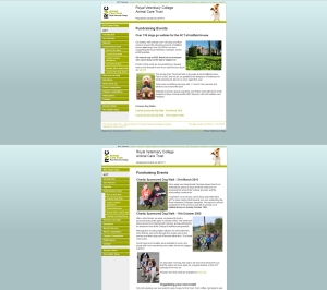
Another charity dog walking event website, is uses green again as its colour scheme which seems to be a common colour used . The website is good and has a strong navigation bar on the left hand side of the page. The images feature as a key point on all pages and help to keep the viewer interested as they read the information surrounding the event.
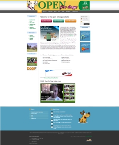
Open for dogs is another website I think is well designed. The purpose for the site is one that advertises places, b&b’s, hotels, beaches etc open to dogs. Quite a good ides for people that are looking for a day out or holiday that they can take there dog to. The navigation bar is ran across the top of the page and is simple to use. It has a few advert links on the page that does cheapen the overall look of the site in my opinion. I like the footer bar and the cartoon dog that it shows. I think something like this would be great for my site.
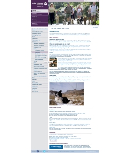
The website for dog walking in the lake district has a nice header image with strong images running throught. The layout over all is quiet simple but not great visually.
Another dog walking website this design is simple and has a nice designed logo header. Overall Its easy to use and layed out well with a simple navigation bar on the left hand side. I think that the images are so importanat for these sorts of events and I want to ensure that I choose the right images for my site.
Another example of a green website, I think that this colour is used a lot as it relates very well to the subject. I have an idea of using a green colour as my theme possibly with a photo of grass in a park as the background. The logo for this site also works very well with a simple dog illustration incorporated.
This is a very basic website, this site uses a large cartoon image as its hero image throught the site. I think that the way this is wrapped up in a border makes it work better as a whole.
Design ideas
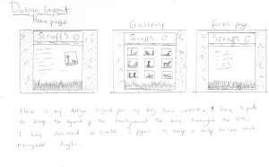
Below are a few initial sketches I have created for a homepage for my dog show website.
Images for Website
Here are a collection of images I have found that could be used for my website.
A nice image that could be used in any part of a website even cutting the sign out and using the dog image as a logo.
Very cool illustation showing a dog walker with a real parisian coolness about her. Again the dog elements could be used on a logo or as a characature throught the website.
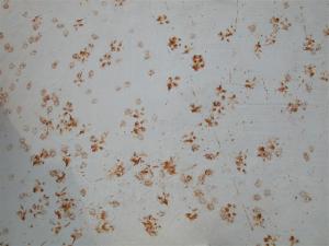
Muddy paw prints are always a classic with any animal related design. Could be used as a background image or even as a logo image with a simple little paw print next to the name.
Photo of dog walkers on brighton beach could be used on a brighton related dog show event.
Lovely black and white life magazine photo of dog walkers. think its best for me to stick to colour images tho.
Another classic set of paw prints that could be used as a filler on any area of a dog website.
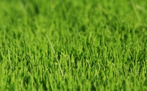
 I had the idea of using an image of grass as my backround, I think it would look great and give a nice vibrant colour. The colour green also is a sign of health and outdoor activity which most dog owners can relate to.
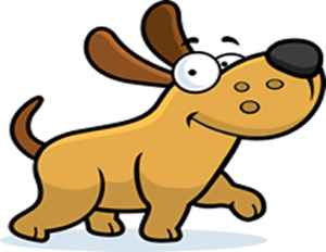
a cartoon character of a dog that could be used as a hero image.
Large paw print, think this could be used a logo image or a marker somewhere within the website.

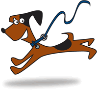 The cartoon characters seem to be a reoccuring theme within the dog websites. I would like to try and incorporate a cartoon character somewhere within the site that could be a mascot. These sort of things tend to work very especially with younger people and always promote an element of fun to the theme.
Photos of Dog Show
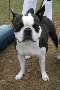
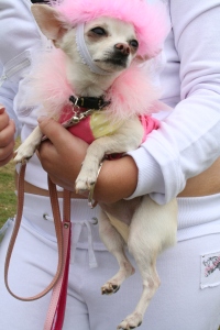
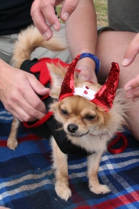
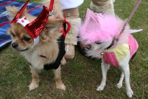
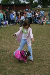
I was able to attend a local dog show and capture some images of the dogs and people using a digital SLR. My aim was to collect images with a comical feel about them ie dogs in fancy dress as I want to have a fun and friendly webpage. Most peoples idea of a dog show would be a uptight and very serious event with lots of rules and regulations. This is the exact opposite of what I want my website to portray to the target audience. Below are the images I have collected for this theme.
Examples of website creation
Below are a few examples of website creation I have produced during this project.
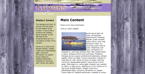
This is a design I have created using dreamweaver at a basic level. I have inserted a header I designed in photoshop along with a custom title font and a side image from an illustration.
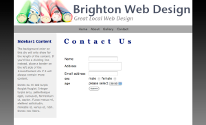
This was my first attempt at creating a form on dreamweaver, it uses a couple of different fields to fill in using drop down bars and tick boxes. I will use this tool on my final design for this project.
Linking
This is an example of a website that I have created that uses working navigation bar. By clicking on the chosen header the user can access specific sections of a site. A key tool for any website these buttons must always work properly and be easy to navigate through.
Inserting Media
This website I have created has media such as video and sound clips. By inserting keymedia such as this you are able to get information across easily and quickly to a mass audience. It also benefits to link your site to well established sites such as youtube in order to gain hits from their users.
Research and Ideas
This site really appeals to me in it’s design style. I like the green grass border and the footer bar also works very well. For a dog show this sort of design would work great with the right content on top of it. I will take away ideas and elements from this sight and evolve them into my own design for this project.
Linking Sight
Linking well known media sites such as youtube and flicker along with social sights such as facebook and twitter is a great way to promote events such as a dog show. I hope to include links on my design to make the most of these sites and make it look like a genuine event.
Tracing On Illustrator
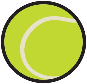
Below is a photograph of a tennis ball and a trace I have created using Adobe Illustrator. I think for fun light hearted events such as a dog show the target audience is very broad so the style of the design needs to be quiet neutral and effective. Using cartoon graphics and bright colours you can keep the attention of the viewer on the event and remain lighthearted. By doing this I can assure that the site wouldn’t be putting people off who may be intimidated by a high gloss serious site.
Website Elelment Design
Now I have a decent idea of how I want my final idea to look I can begin to create the elements I will use. I need to keep all the elements relevant not only to the theme but to each other aswell. My main colour theme is going to be green as I feel it would meet all the requirments I am looking for. The colour green occupies more space in the spectrum visible to the human eye and is second only to blue as a favorite color. Green is the pervasive color in the natural world that is an ideal backdrop in interior design because we are so used to seeing it everywhere. The design would be in keeping with the idea of a dog show in an outside space such as a park.
The natural greens, from forest to lime, are seen as tranquil and refreshing, with a natural balance of cool and warm (blue and yellow) undertones. Green is considered the color of peace and ecology.
How the color green affects us physically and mentally
* Soothing
* Relaxing mentally as well as physically
* Helps alleviate depression, nervousness and anxiety
* Offers a sense of renewal, self-control and harmony
Design Ideas for Website Layout
Header Image
Here I have created my header logo, using several elements and a custom font type. I then places the tennis ball illustration next to the title to give a simple but effective hero image that could be used over and hopefully recognizable to the target audience. By then placing a subtle drop shadow on all the elements I can assure the layers stand out from the green background. I have faded the bottom of the header into white using a gradient, I would place my navigation bar here.
Footer bar
On my footer bar I want to use an image of grass the same as some of the webistes I have looked at earlier. I have created an image on illustrator to place as my footer. It found the task of creating the grass on illustrator difficult, but feel that I have learned a lot about using tools such as symbol and spray can tool. Using the same font I will them place the text and icons below onto the grass on my final design.
Background Design
This is my background design, I will place it behind all the other elements and think it will work really will to tie the whole design together. The grey Box will help to keep the content organised and easy to see from the grass behind.
Polaroid Element
I have created a polaroid element that I will place on the main page. I will use the photographs I have taken of the dog show and place them on top of the polaroid to make it looks like home snaps of dogs at the show. Hopefully this will add a real element of comedy and fun to the design.
Rough Design Layout
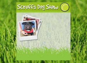
This is the first rough layout of my elements placed together. I think with more content and icons the site will look really nice. I’m happy that it is coming together and think that my research and planning has paid off in the design I have created.
Final website Layout
Below are my final three pages for the website I have produced for this project. The project was to produce a website with at least three working pages promoting an event. I chose to do a light hearted dog show for my project and feel that my final outcome has turned out exactly as I had hoped.
This first image is of my homepage which has links to other related websites and funny images in a snapshot to show people what the event is about. I think it works very well as and opening page and I am pleased with the look.
The gallery page shows images of the dog show I photographed. The images all use javascript to give them a nice user friendly feel about them. I have kept the background image the same throughout to give it a smooth and easy feel.
 The final page is for a contact form and if the event was real it would allow people to take part in events by signing up in advance.


